Problem
With the existing mobile website application, the users are not comfortable while performing certain transactions. And it takes a huge time to book/cancel the train tickets, and also to check the train timings on related screens. The options in each page are not readable, and as a result of this the user is not happy using the current application.
Heuristic Analysis
- Login Page
The Login page seems to be too cumbersome for customers, as it is loaded with many Ads and promotions. The User Id and Login field seems to be placed in left hand corner which makes the user zoom in and select the fields to enter the details.
- Booking options page, Calendar, Train List and Zoom in Train List page
-
- Too many ads in the page makes the user uncomfortable in booking the tickets.
-
- The Calendar seems to be covering the entire page which is not appealing.
- The Train list is long and the user needs to scroll to check the train availability and timings.
Improvements/Suggestions: Rebuild the page layouts and arrange the options, so that the user can comfortably book/cancel/check the tickets.
- Early Ideas
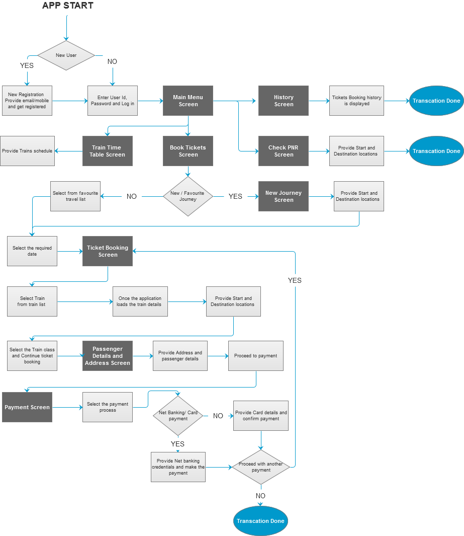
As I began the project, I realized that the first time user setup was going to be the largest and most difficult part of the app. I started with a user flow diagram that laid out the “happy path” as well as a smattering of edge cases:
As the user flow took form, it became clear what screens needed to design. Here are a few early sketches:
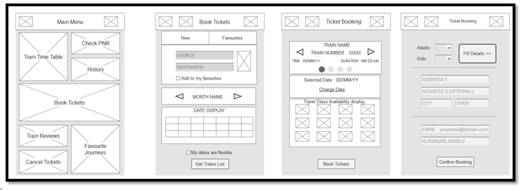
Initial wireframes
Final Design
The screen flow shows how a user can use the app for making the required reservations.
